Visualizing the Breath-taking Cyclical Rotation Trade – August 1, 2024
Most investors are unaware of the rebirth occurring in the stock market.
A flat-lining S&P 500 masks the monster strides the average stock is making.
Today we’ll be visualizing the breath-taking cyclical rotation trade that’s not slowing down anytime soon.
Stock picking shouldn’t be a popularity contest. It should be a profit contest.
For years, The Magnificent Seven has captivated investor enthusiasm. Record earnings and heaven-bound stock prices caused an extremely narrow market.
At last measure, these handful of names amount to 31.1% of the entire S&P 500. That’s a stunning feat to say the least!
This massive concentration came at the expense of the average stock which has heavily underperformed for years… until recently.
Since the June CPI print on July 10th, just 3 short weeks ago, Wall Street’s rotational trade of the year was set in motion.
A long overdue capital flight out of mega-cap Tech and into small- and mid-cap equities has been breath-taking.
Today we’ll dive deep into my favorite charts highlighting where new capital is flowing. Then we’ll look at one historical study that suggests this small-cap renaissance is only just beginning.
Visualizing the Breath-taking Cyclical Rotation Trade
If your research only encompasses major indices, you’re missing a world of change…healthy change.
If we rewind the tape to July 5th, the S&P 500 had 3 distinct character traits:
- First, the index was up a handsome 16.92% YTD
- Second, the percentage of stocks outperforming the index was at a historic low of 20.5%
- Third, the YTD return for the average stock vastly underperformed at just 5.22%
Check it out:
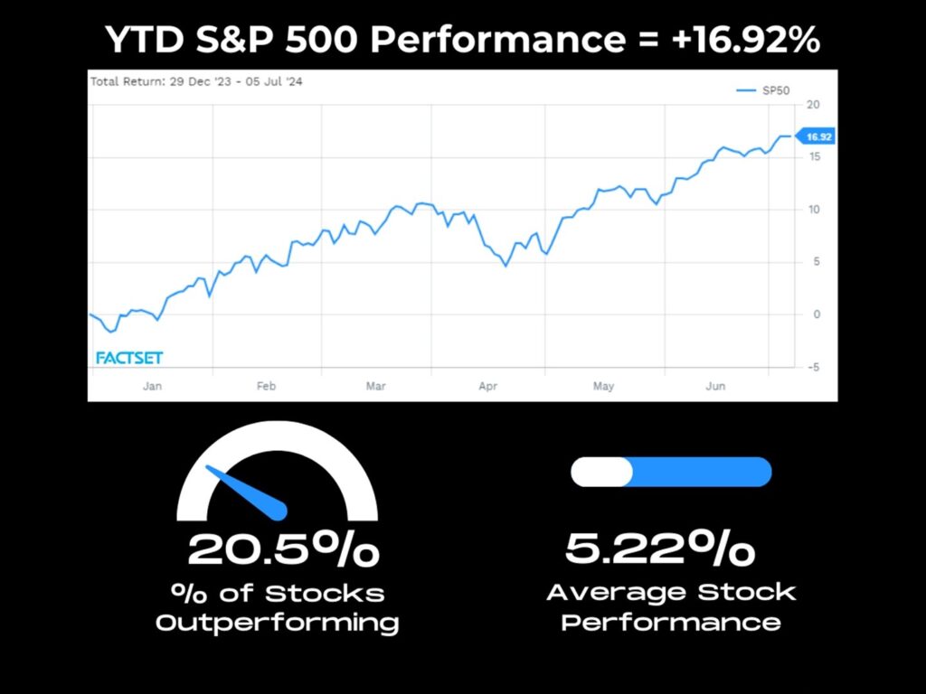
This extreme weakness under the surface had us see the obvious trade setup that was ahead. In June we said that a monster reversion trade was coming.
We bet that a violent catch-up trade was around the corner.
And boy did it come. The ice-cold June CPI print was the spark that ignited one of the largest rotations in recent memory.
Yesterday’s ultra dovish FOMC meeting only reinforced this new rotational reality.
Let’s now use the same framework as above through July 31st. On a YTD basis the S&P 500 is still up 16.7% but the internals have drastically improved.
Now, nearly a third of stocks (32.7%) are outperforming the overall index. Even more impressive is how the average stock is now up 9.45% on average:
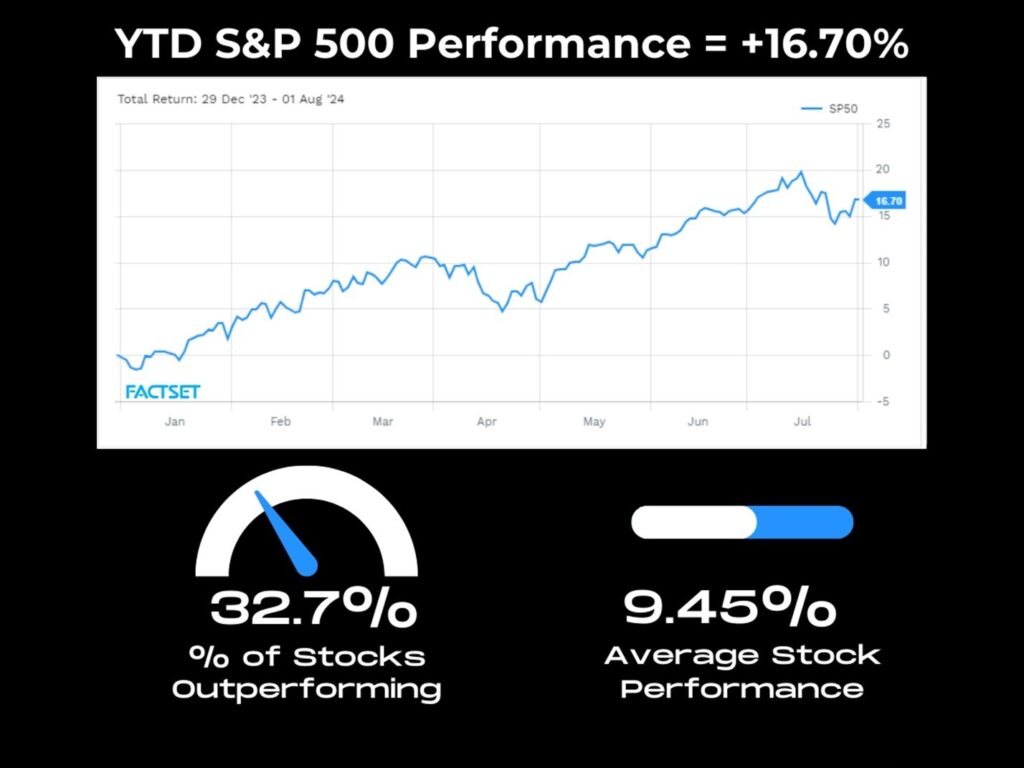
What this character shift highlights is the new institutional appetite for recent left behind laggards.
Money managers are clipping off gains in mega-cap tech (Mag 7) positions and sprinkling capital across the entire S&P.
But this is peanuts compared to the awakening occurring in small-caps.
This is where visualizing the breath-taking cyclical rotation will drive home how violent this catch-up trade has become.
Below plots out both the S&P 500 and S&P Small Cap 600 sector performances since July 10th. With this lens you’re able to see exactly where capital is rotating.
Small-cap cyclical sectors like Financials, Communication Services, Discretionary, and Industrials are all up double-digits.
Contrast that to the large-cap’s heavy relative underperformance and the notable negative returns in Info. Tech at -7.95%, Communication Services -7.5%, and Discretionary -2.92%:
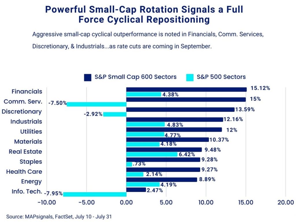
Clearly viewing indexes alone misses a lot of information down below. And this action is incredibly constructive.
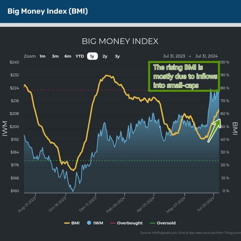
Money being spread around the market-cap spectrum means there’s a rising tide…and there’s no better way to understand this than with our trusty Big Money Index (BMI).
As a reminder, a rising BMI indicates that more stocks are under accumulation relative to those being sold. Lately, it’s been rapidly gaining as this rotation gathers steam.
Below shows this beautifully. At 65%, we’re nowhere near overheated levels:
Up to this point we’ve highlighted the healthy breadth improvements in large-caps and the violent risk-on action in small-caps.
Now, it’s time to drive home why this small-cap renaissance is in its early innings.
If we rewind the tape back to March, we told you that rate cuts may be delayed, but they won’t be denied, when we offered 7 charts signaling more pain for the bears.
Looking at the latest Fed rate cut odds, Wall Street is certain that at least a 25bps cut is coming in September.
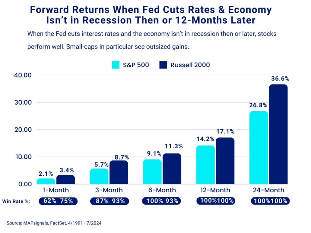
Want to guess how stocks perform when the Fed cuts rates and the economy isn’t in recession and doesn’t fall into one a year later?
GLORIOUS.
Since 1991, whenever the Fed lowers interest rates and the economy isn’t in recession then or a year later, the S&P 500 and Russell 2000 stage massive rallies… but small-caps take the cake with:
- 3-month returns for the Russell 2000 of +8.7% vs 5.7% for the S&P 500
- 12-month returns for small-caps of 17.1% vs 14.2% gains in large caps
- Be bold for 24-months and the Russell 2000 averages a mind-numbing 36.6% rip vs a 26.8% climb in the S&P 500
This is why we’ve been banging the small-cap gong. We have a 3-part bullish thesis grounded in evidence.
The small-cap cyclical trade is in full force when you visualize sector action.
Couple it with healthy capital inflows and coming rate cuts…one phrase comes to mind – R.I.P. bears!
One of the best stock picking environments is here now.
Let’s wrap up.
Here’s the bottom line: The long-awaited rotation is here, taking Wall Street by storm. Ultra-crowded Mag 7 positions are being trimmed, favoring a monstrous cyclical trade in small-caps.
This doesn’t mean the Mag 7 is dead…there’s now a fundamental driver to own highly-levered smaller companies as the interest rate noose is loosened.
Go big by going small.